Monday, May 2, 2011

PSA's

So i chose to do my PSA on single parenting. The pictures didn't come out quite as i originally pictured but they still work. here is my "copy" or the paragraph we had to write about our subject.
According to the U.S. Census Bureau there are 13.7 million single mothers and fathers currently raising their children in the U.S. and this number has remained the same since 1994. Most single parents are mothers with 82.6% and fathers only accounting for 17.4%. Whether or not the parent is a mother or father, those children are still more at risk than children with two parents. For example, single parent kids are more likely to be killed, to commit suicide, to become teen moms, to have behavioral problems, to be incarcerated, to drop out of school, and to commit rape. But don’t worry these risk factors are preventable and will not happen to everybody. If you are or know somebody who is a single parent and need help go to http://www.usa.gov/Citizen/Topics/Benefits.shtml. You may also visit
http://www.grants.gov/ . There are many other federally funded institutions that could help as well. Just remember, be a parent.
And now here are my pictures...


Hope you like them:)

Monday, March 21, 2011

my warhol images

I don't know why this image came out so small. Hope you guys can see it.
Andy Warhol
·         Real name is Andrew Warhola (8/6/28-2/22/87) (Became Warhol after a misprint)
o   Born in Pittsburgh, PA, Parents from Czechoslovakia (does not exist anymore)
o   Father worked in a coal mine
·         In High School, kicked out of art club because he was “too good”
·         Graduated from the Carnegie Institute of Technology (Bachelor of Fine Arts)
·         Graduated with degree for pictorial design & wanted to become a commercial illustrator
·         Designed advertisements for women’s shoes
·         Used Polaroid camera
·         Fear of hospitals and doctors, hypochondriac
·         Favorite print making technique was silk screening
·         Friends & family described him as a workaholic
·         His sexuality was speculated upon and how this influenced his relationship to art is “a major subject of scholarship on the artist”
·         First solo expedition in 1952
·         Coined the term “15 minutes of fame”
·         1960s: iconic American products (pop art)
·         Created The Factory, his NYC studio from 1962-1968
·         Celebrity portraits developed into one of the most important aspects of his career
·         Made films (first one called Sleep – 6 hours of a man sleeping) (1963)
·         1965 said he was retiring from painting
o   1972 returned to painting
·         Designed cover for the Rolling Stones’ album Sticky Fingers (cover made out of real jean material)
·         Produced Velvet Underground’s first album
·         Started a magazine called Interview, worked for Glamour Magazine, Vogue
·         Shot by Valerie Solanas 3 times for being abusive and “too controlling” (6/3/68)
o   Solanas authored the S.C.U.M. Manifesto, a separatist feminist document
o   "Before I was shot, I always thought that I was more half-there than all-there – I always suspected that I was watching TV instead of living life. People sometimes say that the way things happen in movies is unreal, but actually it's the way things happen in life that's unreal. The movies make emotions look so strong and real, whereas when things really do happen to you, it's like watching television – you don't feel anything. Right when I was being shot and ever since, I knew that I was watching television. The channels switch, but it's all television."
·         Marilyn Monroe = favorite model (not painted until after death)
·         Wore silver wigs until he dyed his hair silver
·         Practicing Ruthenian Rite Catholic who described himself as a religious person
·         Died of a heart attack brought on by a gall bladder surgery and water intoxication
·         $100,000,000 for one of his paintings (highest amount paid) (“Eight Elvises”)
·         Referred to as the “Prince of Pop”

Sunday, March 13, 2011

final photoshop-

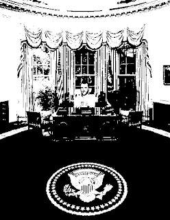
For this assignment we had to choose an image to adjust in photoshop. We have learned many different techniques in photoshop, so which one do I choose? Do I do something simple like turning the image from color to black and white? Or do I do something more difficult like color layering? There are so many options to choose from. I decided on a fairly simple technique called copy and pasting. Its procedure is just how it sounds—you copy and paste one image onto another. That is the jist of this technique. Just kidding I am going to explain more in the next paragraph so keep reading.
            So as I said earlier the process or procedure for this technique is fairly easy to do. What did I do to get my final outcome? Well first, I chose two images. For this photoshop image, we could use other pictures that were not our own. I chose a picture of San Francisco Giants’ closer, Brian Wilson and a picture of the president’s oval office. Ok here we go, I am going to take you step by step through this process. It doesn’t take very long so I might digress a little just to prolong it. No I’m only kidding or am I? I am doing it right now. For real now, here is the step by step process. So, the first thing I did was open these images in photoshop. Next, I clicked on the oval office picture and checked its image size. Then, I did the same thing for the Brian Wilson image. I was in luck because both of the images were the same size and lazy me didn’t need to change them. Next, I clicked on the magnetic lasso tool which is located on the upper left hand side of the page. I used the magnetic lasso to select Brian Wilson out of his original image. My first attempt to get a clean cut Wilson failed; actually it took me a couple of tries to get the perfect outlined copy. After I got the best copy of Wilson that I could get, I went to the edit menu and selected copy. I then proceeded to paste Wilson on the image of the oval office. Then, I chose the edit menu and clicked ‘free transform’ so I could adjust Wilson to the size I wanted. I adjusted Wilson and put him in the president’s desk. Once I was finished with that, I flattened the image so I could put a filter or some other effect on it. Instead of a boring photo filter I decided to put an effect. I went to the image menu, clicked adjustments and chose threshold. I don’t know if we could just do threshold without color layering, but I did because I only wanted that effect. Well, that was the process step by step; it wasn’t too hard or too long to follow, right?
so brian wilson as president?? i say yes.

Friday, March 11, 2011

Andy Warol

Some facts about Andy Warhol:
-Andy was born in 1928 in Pittsburgh as the son of Slovak immigrants. original name was Andrew Warhola
-worked as an illustrator for magazines like Vogue and Harpar's Bazaar
-His first iconic image was a painting of a Campbell’s soup can>>was an idea he’d bought from the gallery owner Muriel Latow for $50
-didnt enjoy using paint so sister suggested that he do silk screening
-did portraits of Elvis, Marilyn Monroe, Troy Donahue and Liz Taylor
-then did images based on car crashes, race riots and electric chairs
-then did flower paintings
-1964 made The Factory
-June 1968  shot by Valerie Solanas but survived
-He died as the result of a routine gallbladder operation on Feb. 22, 1987.

(source of info ny times article about him)

some of his artwork

Photoshop pictures

Ok so this is an image with a photo filter. The first thing i did was open the original image in photoshop. Next, i duplicated the background layer. After that, i pulled down the image menu and clicked on adjustments. i chose 'photo filter' as my adjustment and brought up this box thing where you could chose what filter you wanted. i think i chose cooling filter 82 because it made the image a purple-y color that i liked. the original image was more orange-y since it was sunrise. 
This is a black and white photo with color emphasis. the first thing i did was upload the image and duplicate the background layer. Next i used the magnetic lasso tool to select the part of the image i wanted to keep in color. i chose to keep the yellow in color. so after i selected that with the lasso i went to the select menu and chose 'select inverse'. that makes it so it selected everything around the middle of the flower. then i went to image>adjustment>desaturate.
For this image i duplicated the background. then i made sure both images were the same size. then i used the magnetic lasso tool to select the flower. i clicked copy and then pasted it on the tree. then i did that lasso again and copy and pasted the second flower on the tree again. i did free transform to adjust the flowers to a good size. then i flattened the image and saved as a jpeg.
blended. hmm what did i do to this image to make it look like that. well first i made sure the two images were the same size. then i picked my target image(the one i wanted as a background). then i went to the image menu and clicked apply image. then a box popped up and i chose the other image in a drop down menu. <that makes no sense but i think people in my class know??.. after that i flattened the image. when it was one image i went to image>adjustments>photofilter. i forgot which filter i chose but i think it was a cooling one. Wait, no. it was a choice from the drop down box where it says 'multiply'. i think i used hard light but i am probably wrong...
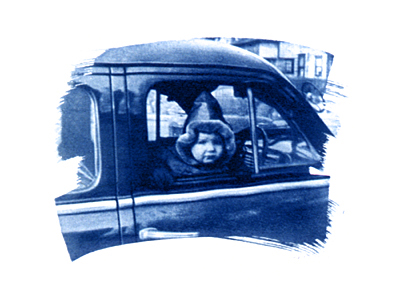
little toy photoshop. For this image i really dont remember how i made little willie blue. i know that i used a photo filter to make the background that color. the filter i chose was sepia. hmm i think i might have duplicated the image a few times and then flattened them into one. after the sepia, somehow i turned willie blue with a blue filter and adjusted the  opacity to make it darker. (dont ask why i put him in dodger colors. yuck.) Then i duplicated the image like nine times(one for each glove). i used the lasso tool to select the glove and pasted it somewhere on the car's seat. i repeated that nine times and that is how i got this effect.

Wednesday, February 16, 2011

Blended & Copy/Paste Photoshop images

In this blended image, I mixed my unity picture of daisies and my movement and rhythm photo. After i did the steps to blend the image, i messed around with the kind of effect. I think i chose 'vivid light'. After that i changed the hue of the image to make it look that light blue color.

For this image, i used a picture from the nature walk and the flower from the black/white stuff. I just copied and pasted the flower twice(one on each tree). i thought it would make the image look like two giant flowers. i dont know if really gets that full effect but it still looks cool.

Wednesday, February 2, 2011

Landcape Assignment

BIG SHOT W/O PHOTOSHOP
so i took this picture at santa cruz while i was on the ferris wheel and thought it would be a good big shot picture.
Big shot with Photoshop

On photoshop i used the cooling filter 82(i think) and that made the hue of the water more blue but it kind of made the rocks off color. oh yea i also used that gradient thing in the corners. i think it makes it look like i'm spying on the beach...haha

Detail
i took this image at the beach. i think it looks good and can qualify as a detail shot. maybe i should've got closer to the rock.
Abstract
i am not sure that the following image is very abstract because i can sort of tell that it is a plant.....hmh.....

Friday, January 28, 2011

Architecture

so let me start off saying that i tried my best to take artistic pictures. i was absent during the week this was assigned so i missed some things but i read my book. :)

Location 1: local park. I don't know for sure if play structures count as architecture but i was trying to think outside the box. Since someone has to build it and it has lots of shapes/lines, i thought that this play structure would be good. It didn't turn out as i planned...

Location 2: Buri Buri Elementary School. I decided to take a detail shot of the school building. I seen a little mural on the side of it and thought it would make for a good picture. Obviously schools are off limits after school hours and on the weekend so there is a fence there. i think the fence adds something to the picture. hmm but i dont know.

Location 3: My house. So i got lazy on this last one and decided to use my house as the subject. first i did the big picture. the outside of my house is boring so i included my palm tree and the front entrance. For the interior of my house, i took a picture of part of my kitchen. And finally the detail pic, i used my fence because i didn't think the stucko material of my house would make for an interesting picture.

interior
big3
detail3

Thursday, January 20, 2011

Landscape Photographers #2:Heidi Kirkpatrick

-Heidi was born in 1959 in the city of Springfield, Ohio.
-Based in Portland Oregon
-Kirkpatrick’s work is included in collections at The Museum of Fine Arts (Houston), the Springfield Museum of Art and The OHSU Corporate Collection.
-She develops her own images by using silver gelatin printing and a variety of processes
here's an few examples of how they look:
-Heidi photographs using a Holga but is able to make art with what she has.
>>here is what an image from a Holga camera looks like

-In 2004 she started teaching photography at Northwest Academy which is a high school
-Her work often depicts a view of the world experienced by women

Landscape Photographer Bios #1: Ansel Adams


Ansel Easton Adams was born on February 20, 1902 in San Francisco, California. While on the trip with his family, his father gave him his first camera, a Kodak brownie box camera. He used this camera to take his first photographs. His first trip to the Yosemite valley sparked an interest in him so he returned a year later, by himself, with a tripod and some better cameras. After that, he learned basic techniques while working for a photographer in SF. In his twenties, Adams' life philosophy was inspired by Edward Carpenter's Towards Democracy, a literary work which talked about the pursuit of beauty in life and art. He then decided that from then on, his art was to reveal that beauty to others and to inspire them to the same calling.

Ansel Adams' first photos were published in 1921 and a year later Best Studios started to sell them. Adams used different lenses for certain effects but mainly went for a more realistic approach meaning he relied on sharp focus, contrast, exposure, and "darkroom craftsmanship". 1927 he made a contract for his first portfolio, Parmelian Prints of the High Sierras, which contained the famous image called Monolith, the face of half dome.
For this image, Adams used a Korona view camera, glass plates, and a dark red filter. The red filter helped make the sky appear darker.  He said "I had been able to realize a desired image: not the way the subject appeared in reality but how it felt to me and how it must appear in the finished print". This is what most of his artwork looks like, black&white landscapes with tonal contrast. These types of  images is what he is famous for. Adams did try to broaden his subject matter to include still life and close-up photos, and to achieve higher quality by "visualizing" each image before taking it. He  used small apertures and long exposures in natural light to create sharp details with a wide range of focus. An example of this would be Rose and Driftwood (1933).

During the 1930s , he was inspired by the increasing desecration of Yosemite Valley by commercial development. He created a limited-edition book in 1938, Sierra Nevada: The John Muir Trail, as part of the Sierra Club's efforts to secure the designation of  Sequoia and Kings Canyon as national parks. This book and his testimony before Congress played a vital role in the success of the effort, and Congress designated the area as a National Park in 1940.

-President Jimmy Carter commissioned him to take the first ever picture portrait of a president.
- he died April 22, 1984 

Wednesday, January 19, 2011

Ch. 9 Landscapes

Landmarks in Landscape Photography
-Carleton E.Watkins(1829-1916)
>>>wanted to capture grandeur of American West. Opened own gallery in San Francisco in 1858 and after began photographing in Yosemite Valley. His huge photographs were among the first to be made as art.

-Ansel Adams(1902-1984)
>>>also inspired by Yosemite. His photography always tried to capture the experience of being in the wilderness.


Photographing the Landscape
     Thinking artistically:

-Composition is one of the most important aspects of landscape photography and viewpoint is the most important part of composition
-explore all variations when setting up a shot
-value is important....images with wide range of tones are more dramatic & those with smaller range are "quieter"...decide what mood you want your photo to have
-try to achieve balance between unity and variety because it creates art that is interesting to look at without being chaotic and disturbing

     Camera Settings:
-stop down a lens as far as it will go(it depends on which lens you have)
-smaller fstop means longer shutter speeds (tripod is necessary for clear images)

      Light:
-many professional landscape photographers shoot mostly just after sunrise and right before sunset
>>it's because sun is low so shapes and textures are emphasized by side lighting
>>and color of light is warm gold
-in grand landscape photos, direct lighting creates highlights and shadows to make the landscape appear 3D
-for closer shots, direct light gives no detail. Most photographers shoot these on overcast days.

     Film:
-detail-oriented images like landscape photos need to record as much info as possible.
>>use 100 ISO to capture all the details
-black and white showcases value, line, shape, texture, and pattern
    Lenses:
-as a general rule, landscape photographers prefer to use wide-angle lenses that capture more of the scene.

-for concentrating on details or areas in the distance, some photographers use telephoto lenses
-macro lenses are also useful for getting really close up images...use them for capturing details and small objects when you get very close to them.
   Filters:
-using a yellow filter will help bring out the clouds.


-to duplicate the Ansel Adams look of deep black skies with stark white clouds, use a red filter
     Camera Support:
-TRIPODS are useful to get a sharp, clean image
-can't do this type of photography without one{according to the book}

The Grand Landscape:
- the grand landscape is the "big view" for pictures of the great outdoors--wide open expanses that showcase the majesty of the natural world.
-grand landscapes always include a large expanse of the scene, and wide-angle lenses will give you the wider view that you need.
Landscape Details and Close-ups
-Parks are good source for detail-oriented photos
-Fall's vivid foliage or the vibrant flowers of spring will add color to your photos of landscape details

 -Light meters are designed to create an exposure that makes medium or middle gray out of the scene being metered
>>with lighter values, open the f-stop or slow down shutter speed for longer exposure
>>for darker values, close the f-stop or choose faster shutter speed for shorter exposure

Abstracted Elements in the Landscape
-abstracted elements are images composed of lines, shapes, values, and textures
-a good way to turn an ordinary scene into an abstract image is to get really close to the subject and photograph a small part of it
-look for interesting shapes and forms


Monday, January 17, 2011

ch 8 notes

-vertical&horizontal lines help divide images into diff sections
-observe space surrounding objects/buildings
-pattern=the repetition of any of the elements of art
-make image as sharp as possible to see the smallest details
-smaller f stop=greater depth of field=more scene in focus
-value helps determine shapes of objects
-contrast=diff or range of values
---mostly darker values(low key print)
---mostly lighter values(high key print)
-use value to emphasize certain parts of an image
-differences in tonal values also accentuate texture..makes surface look touchable
-commercial--> usually in color for magazines/brochures
-artistic-->usually use black&white
-incandescent: household light bulbs. make things look more orange
-quartz: modern spotlights. make things look more yellow
-flourescent: make things look greener
-wide angle lenses are very useful b/c cant get back far enough to get the entire scene you want w/normal lenses
-use filters to make the lighting appear different and to make images stand out
-Big View: wide angle
-Perspective distortion: strong converging lines in a building, where the sides angle inward toward each other instead of looking parallel as they are in reality
-try capturing the shadows cast by objects-->pay attention to lines, shapes, and values
-Detail shot features individual architectural elements of a building's interior/exterior
-wide angle lenses for entire rooms
-normal lenses or shot telephotos will work well for detail shots